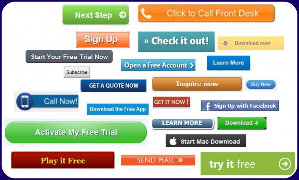
What Calls To Action Will Work Best For You?
I’m sure you have had this discussion many times with your web designer or content management company. What’s the best way to go? How many should you use? What kind of content works best? Should they be viewable or downloadable? I came across some interesting details from blogs I subscribe to and summarised some recent thoughts for you to consider below.
How should firms craft their Calls To Action (CTAs ) for success? It all depends on context. The basic idea is to encourage audiences to take a particular action. Research into the area shows that every detail counts. Because context is very important there is no universally ideal Calls To Action. But certain general principles apply across a wide range of circumstances.
Colour and Size
Your call-to-action should stand out from the rest of the page while making it clear that it is a clickable button. You can accomplish this through design elements like colour and size. Bright and active colours are consistently more effective than greys which tend to appear inactive. The particular click rate on a given call-to-action can vary dramatically according to its colour so testing can be highly useful.
Here’s an example of one test:

As a rule bigger is better for Calls To Actions. A call-to-action typically directs users toward the single action you desire them to take. The mind interprets the significance of page elements according to their relative prominence, so large buttons lend a Call To Action an immediate sense of importance. Consider this call-to-action from Spotify:

This CTA employs both bright, appealing, and active colours as well a large and clear design for the buttons to make users’ next step clear. In this case that next step is to download Spotify. Note that there are actually two calls-to-action directing users to the same end, one in the page’s main stage and one in the navigation bar. While multiple calls-to-action with different goals could confuse users, this design makes it clear what they should do next.
Copy/Content
In call-to-action copy active language is more engaging than passive description. The text should feel both personal and specific. There are a handful of best practices you can follow to make your Calls To Actions as effective as possible:
- Lead with a Verb. Describe exactly what it is that clicking the button will do.
- Be Specific. The CTA above doesn’t say “Download app” or simply “Download.” It tells users exactly what they will get.
- Try Writing the Copy in the First Person. The language shouldfeel personal. Try filling in the blank in the sentence, “I want to ………” Sometimes you may write the copy explicitly in the first person – “Start my free trial,” for example, tests better than “Start your free trial.”
Surroundings
Have you ever seen the three different subscription options to The Economist magazine. It applies to online offers and calls-to-action. When an offer is positioned as the mid-point between two other offerings it tends to convert at the highest rate. It also tends to have a higher rate than if the offer were simply presented on its own.

The middle offer benefits from the presence of less appealing options which may be pricier on one end and insufficient on the other. Given this context, strategic highlighting may nudge users toward the desired path. Once audiences have demonstrated a preference for this option, you may even reinforce the pattern by labelling this choice the “most popular.”
Testing is Critical
When it comes to Calls To Actions, design and copywriting best practices will only take you so far. The best practice that matters most is testing. A/B Testing – comparing the statistical performance of two variants with only one difference – is the only way to learn what works best. For best results, marketers must take a scientific approach to CTAs and maintain that approach diligently. As marketing evolves the leaders in the field will increasingly set themselves apart by using science behind their art.
Contact Avid Partners on 0818 303087, Email Us advice@avidpartners.ie or Visit Us at www.avidpartners.ie.
-
 "A breath of fresh air. Your firm demonstrated enormous commercial understanding in turning around negotiations with a potential target vendor. I admire your style and ability to drive the deal forward. Many thanks."
 -
 "I would like to say I'm very happy with your service, especially the audit team, your staff are always friendly, helpful and a pleasure to deal with."
 -
 "Your business approach to clients is very impressive. I have always found that when explaining the types of service on offer, it is always concise and straight forward. The level of trust that clients place in your company and its staff speaks volumes."
 -
 "I would like to take this opportunity to say how much we are impressed with your company's professionalism, it has been a pleasure working with you all and we look forward to working with you in the future."
 -
 "Avid Partners - Accountants & Business Advisors are an excellent firm of accountants, their quality ethos is outstanding."
 -
 "I have dealt with Jamie O' Hanlon, of Avid Partners - Accountants & Business Advisors Chartered Certified Accountants, for a number of years as he is auditor to one of my clients. I have always found him to be professional and responsive in his approach."
 -
 "Service is second to none; there is always someone at the end of the phone for any business advice. The staff are very easy to get along with, very approachable and know exactly what they are talking about"
 -
 Having got to know the company through the BNI we decided it was time to change accountant. What impressed me about Avid Partners was their professionalism. Their attention to detail was second to none and as an added bonus they are a sounding board to all of my questions. Avid also potted some irregularities in my accounts from the previous few years and saved me substantial money on the years tax bill. Avid Partners deliver a first class service which is everything you could want from an accountant and I am happy to give this endorsement.
 -
 We at Fitzies Bar have worked with Avid Partners - Business & Financial Advisers for over five years. We find that the advice and support offered to us in addition to all of our book-keeping requirements to include payroll, VAT, etc. is invaluable and has helped to contribute to our continued growth especially in these challenging times. I would have no hesitation in recommending Avid Partners.
 -
 Jamie and his staff are a pleasure to work with. They respond promptly to any queries we have and are critical to our financial planning and the future needs of our business. I would highly recommend them to anyone interested in accounting services.
 -
 We at Stillorgan Cycles have used Jamie and his Team at Avid Partners – Accountants and Business Advisers for over five years. We have found that the retail advice and support offered to us is second to none and has helped to contribute to our continued growth especially in these challenging times. I would have no hesitation in recommending Avid Partners.
 -
 I met Avid Partners through a local business networking group. We had been using the same accountants for years and found that in these harsh economic times that we were not getting good enough value or service. We were very impressed by the company's professionalism and enthusiasm and genuine interest in helping us get the most out of our business. As a result we are now clients of Avid Partners and are thrilled with our decision.
